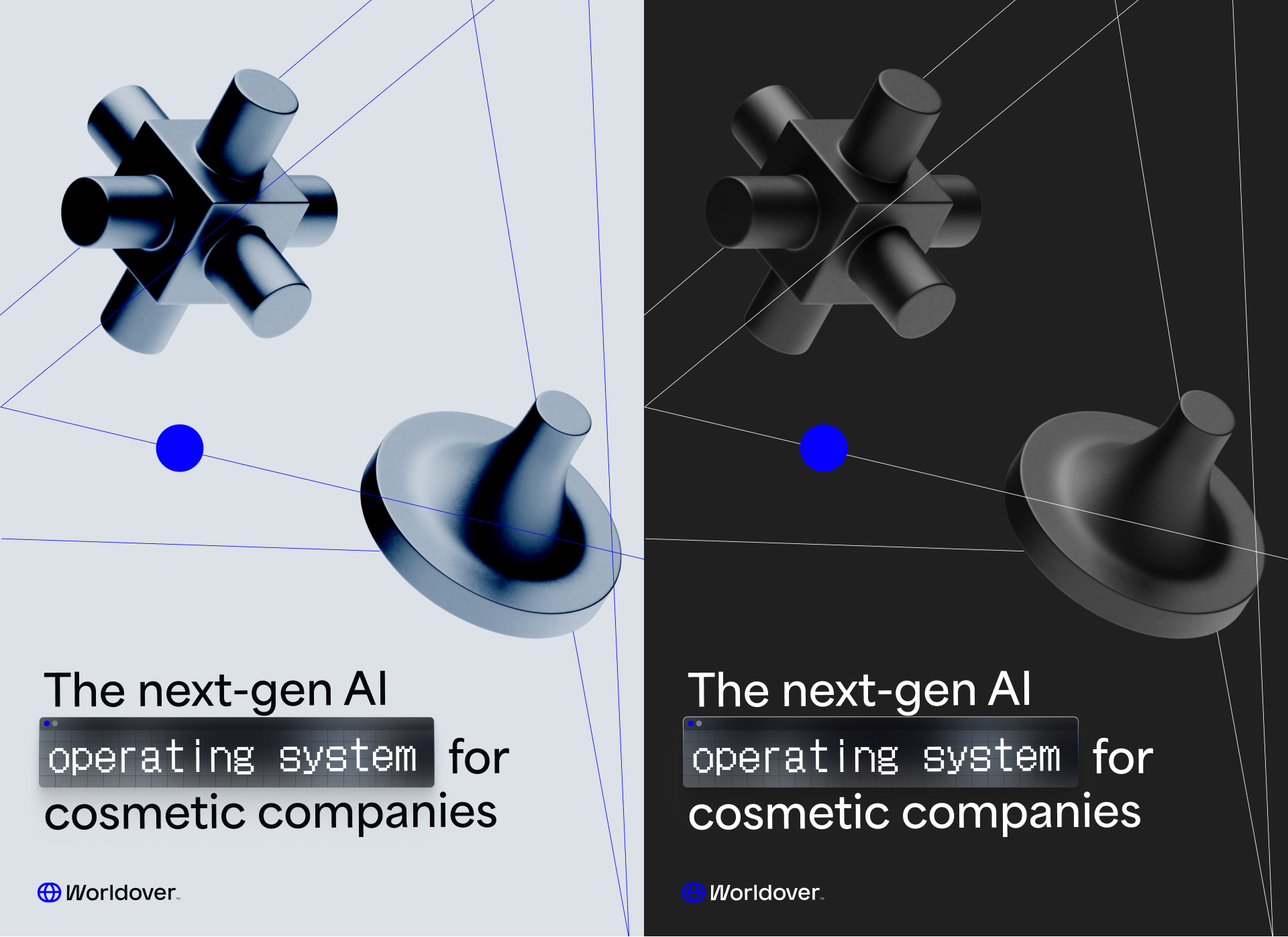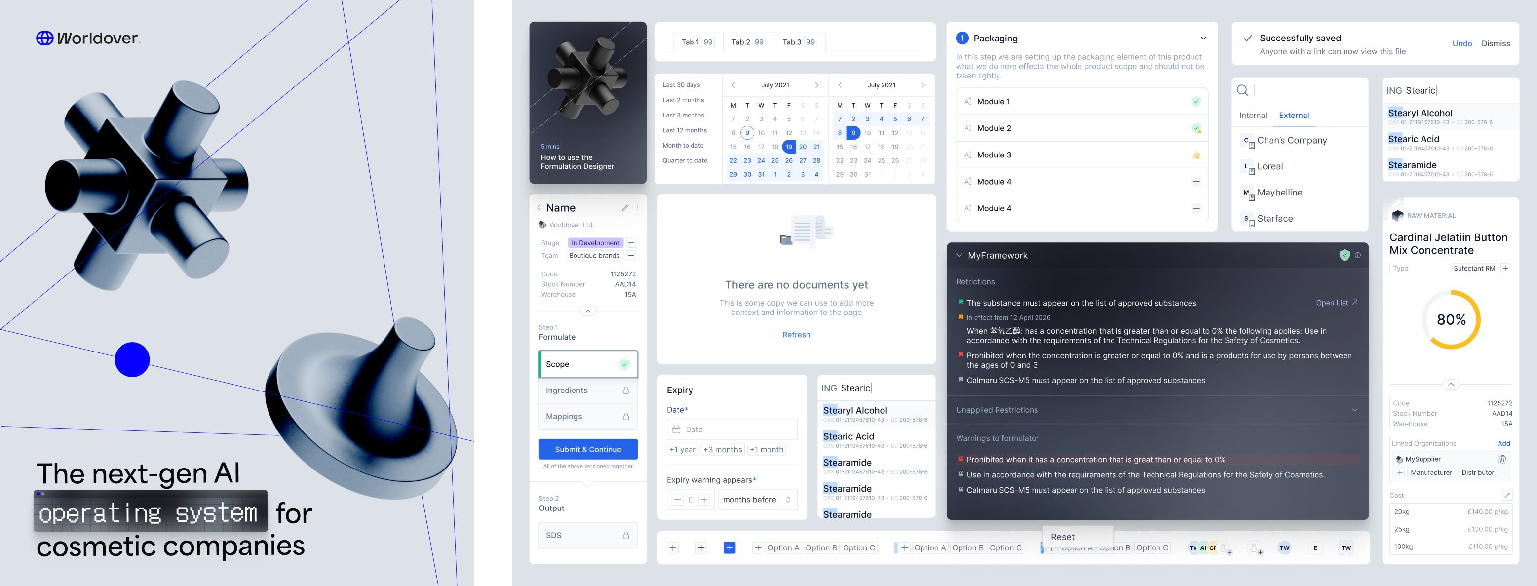
They needed to see that the platform could actually handle the complexity of their operations before they would sign. This meant going from a fairly hardcoded, spreadsheet-driven workflow to something they could own, configure, and operate themselves. As the founding — and only — designer on the team, these are the features I shipped to make that happen.
Rule Builder
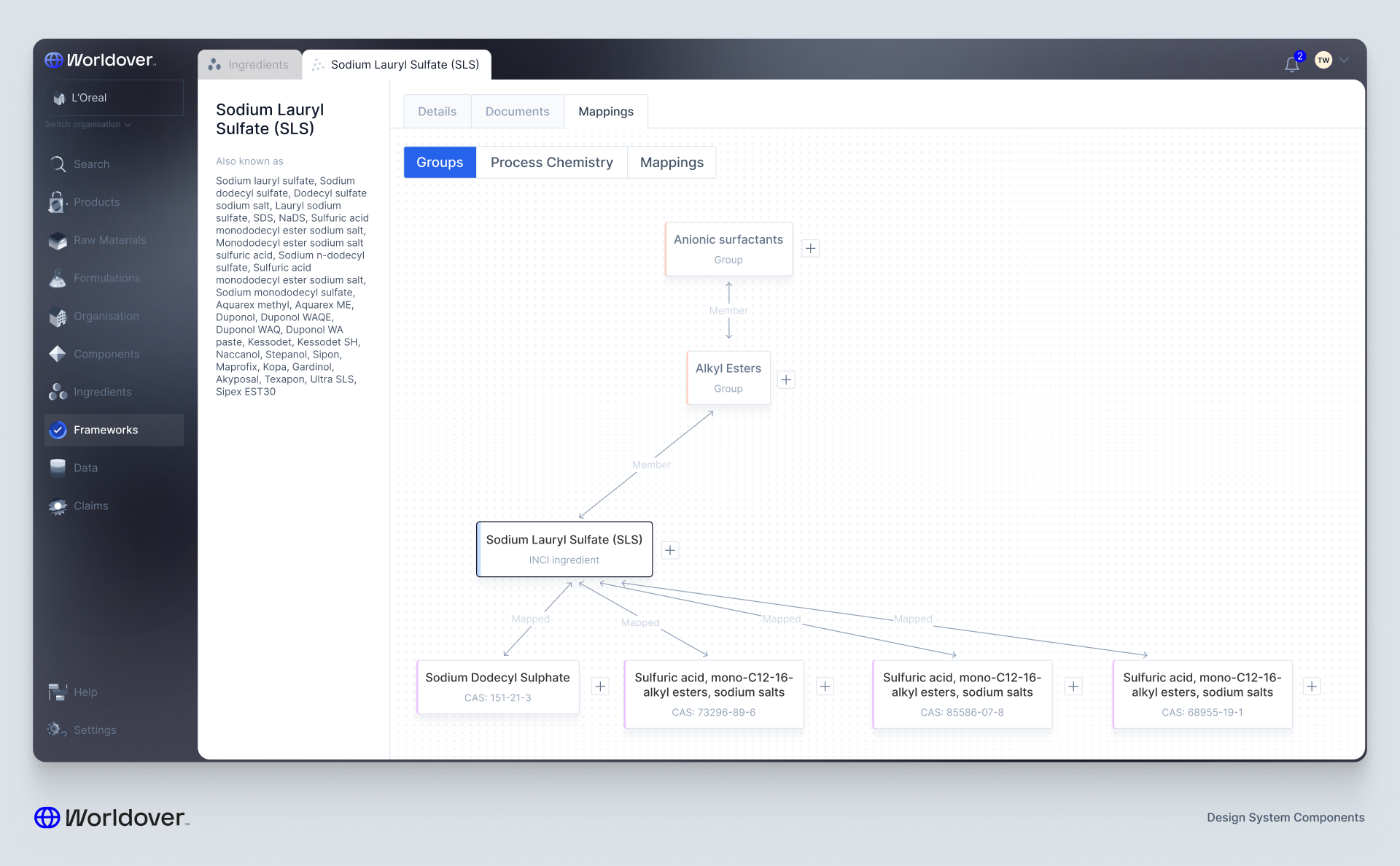
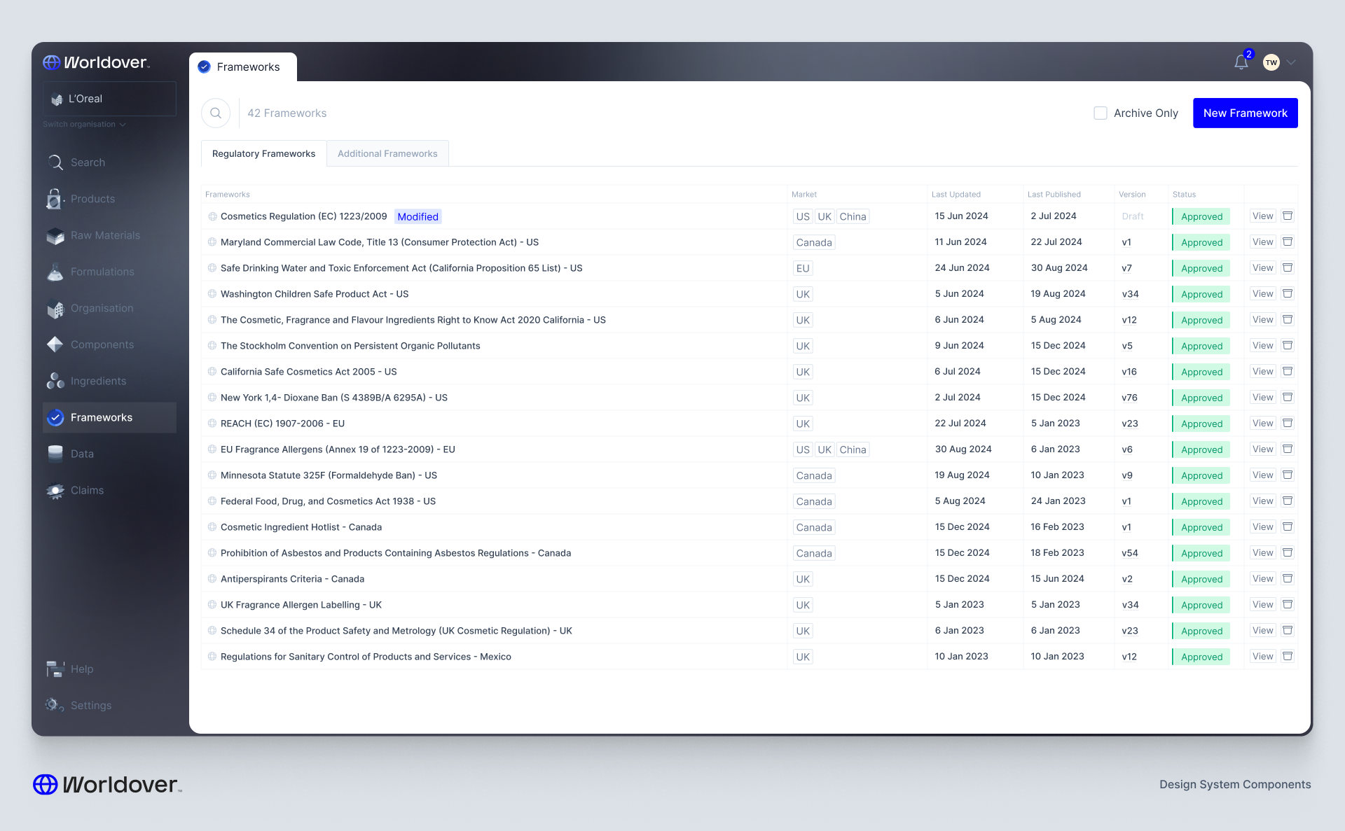
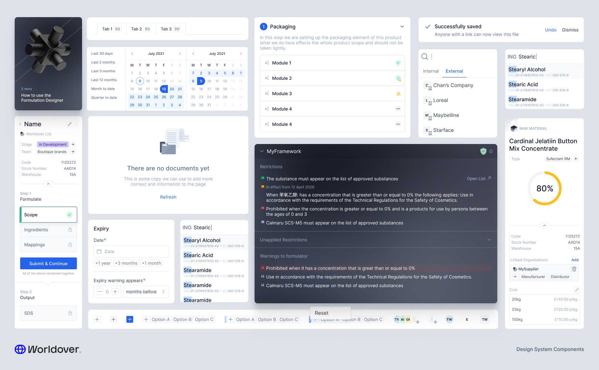
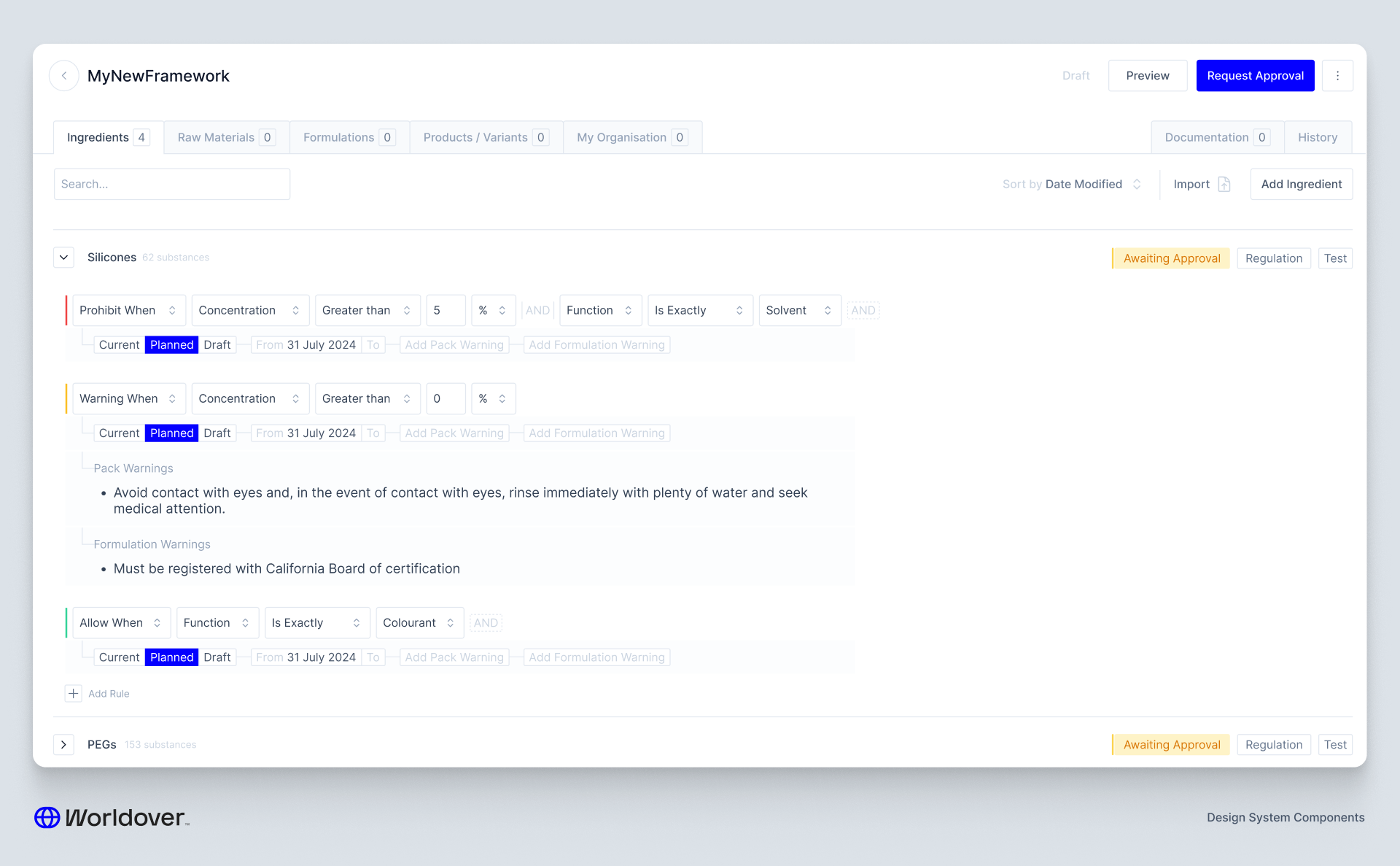
Up until this point, compliance rules lived in a spreadsheet. The compliance team would update it, it would get ingested daily, and regulatory changes would ripple through the system automatically. It worked, but no one outside the team could touch it.
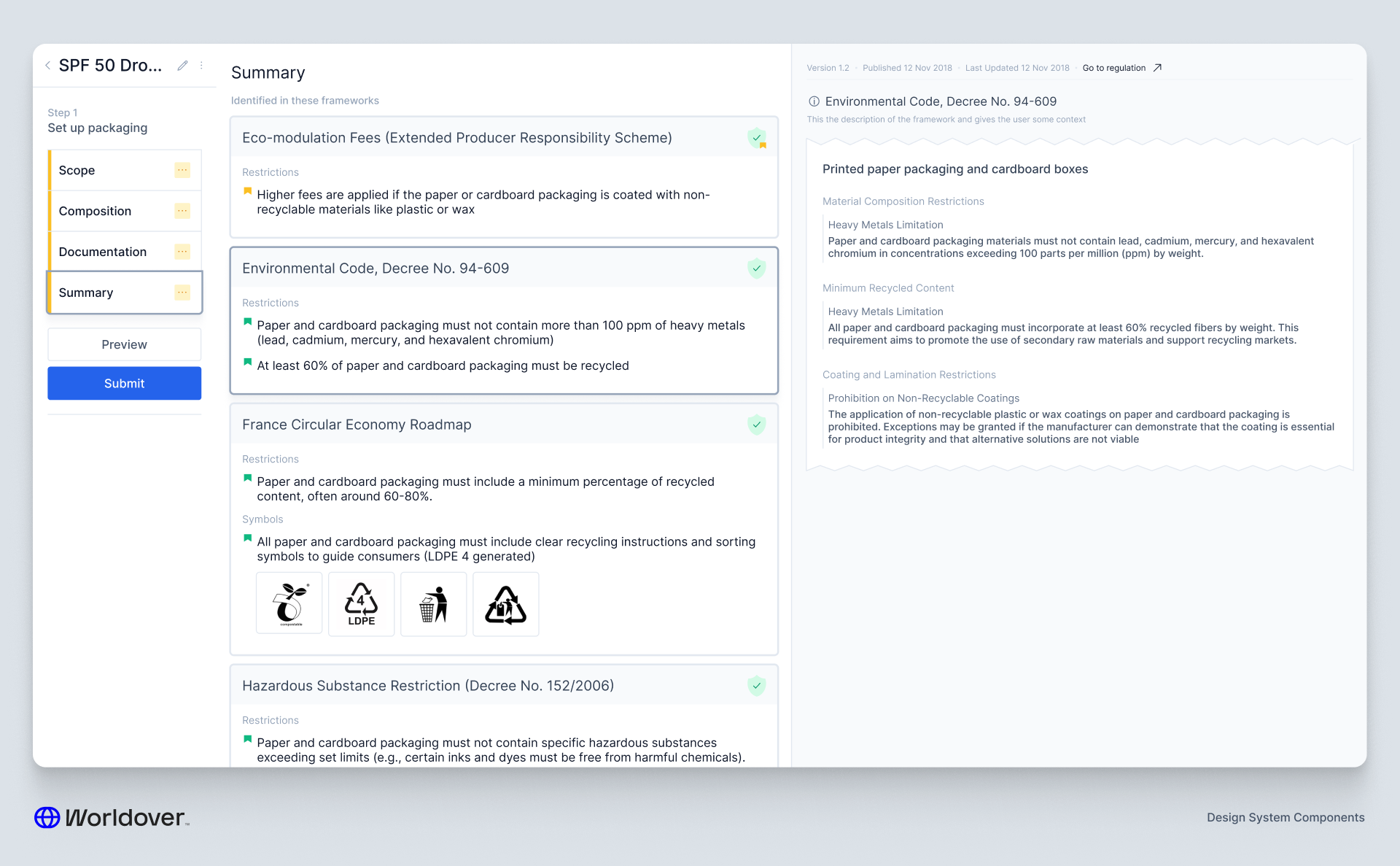
Our client wanted to own that process. They wanted to be able to build their own compliance frameworks — sets of rules that, when applied to an entity like a formulation or a piece of packaging, would flag a violation if something didn't pass.
This was genuinely exciting from a product perspective. Not only did it move a manual workflow onto the platform, it also created a deterministic structure that AI agents could eventually operate within. That's a big deal — especially at the scale of a company selling into 50+ markets simultaneously.
But the design challenge was immediately obvious: ingredients are nested. Deeply nested. Think Silicones → Silicone Elastomers → Dimethicone Crosspolymer. And frameworks can be applied to any entity type in the system, each with their own nuances and edge cases.
The design broke down into three parts:
Versioning and approval flows — I'd built these systems in other parts of the platform so it was mostly about integration, but compliance rules have especially high stakes so we needed to make sure nothing could be published without sign-off.
Per-entity rule creation — Every entity type has slightly different properties. A formulation rule looks different to a packaging rule. Getting that right without making the interface feel like it was built by a committee took a few iterations.
The rule building mechanic — The real meat of it. Representing deeply nested ingredient trees in a UI that someone can actually reason about is harder than it sounds. The goal was to make it feel like you were working with the data, not fighting it.
Scenario Planning
Probably the most intellectually fun problem I've worked on.
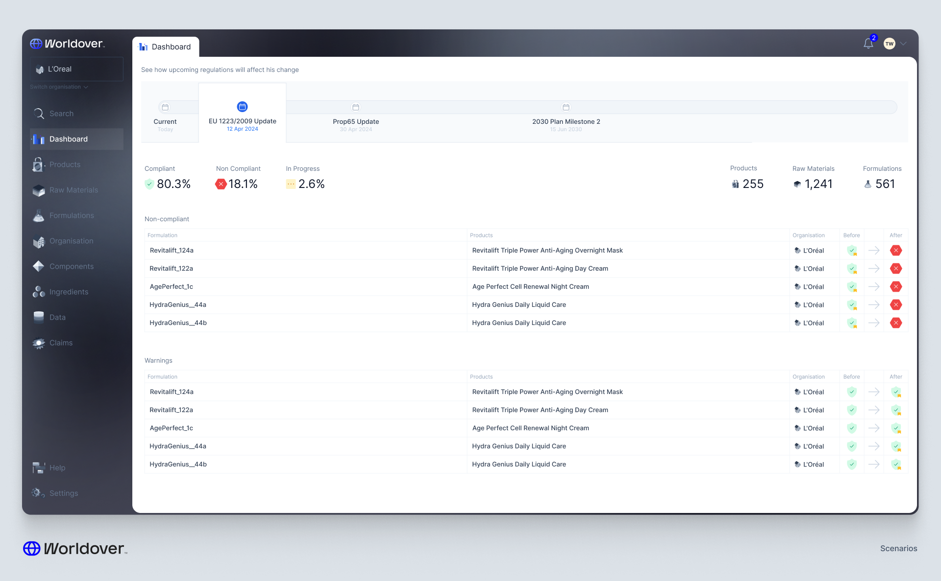
Here's the core challenge: even small changes in a product portfolio can have enormous downstream effects. You switch a supplier, their raw material has slightly higher trace elements of a particular ingredient, that pushes you over the limit in 5 of the 50 countries you sell in, and suddenly a regulatory test needs to be redone. How do you know before you make that change what the exposure is?
And you can apply the same logic in reverse. If a law changes — what's the effect across all your products, raw materials, suppliers? For a company operating at this scale, that's not a hypothetical. That's a Monday morning.
I considered two broad approaches.
The first is what I think of as the Figma approach — you click into a scenario version of the platform and the entire UI becomes navigable as if you are already in that future state. Pressing Esc snaps you back to today. It's elegant and deeply immersive.
The second is the summarisation approach — a timeline of upcoming changes with something like a GitHub diff. You see what will change, across what, and by how much.
Here's the thing that pushed me toward summarisation: the follow-up actions.
When a user discovers an upcoming problem, they need to mobilise a response. They need to make changes to formulations, suppliers, or documentation so that their products remain compliant when the change hits. The summary view lets you see a longer horizon — you can scan further out and make sure the changes you're making today don't create new conflicts six months from now. That's hard to do when you're fully immersed in one simulated future state.
The immersive approach has depth. The summary approach has breadth. Given the scale of what we were designing for, breadth won.